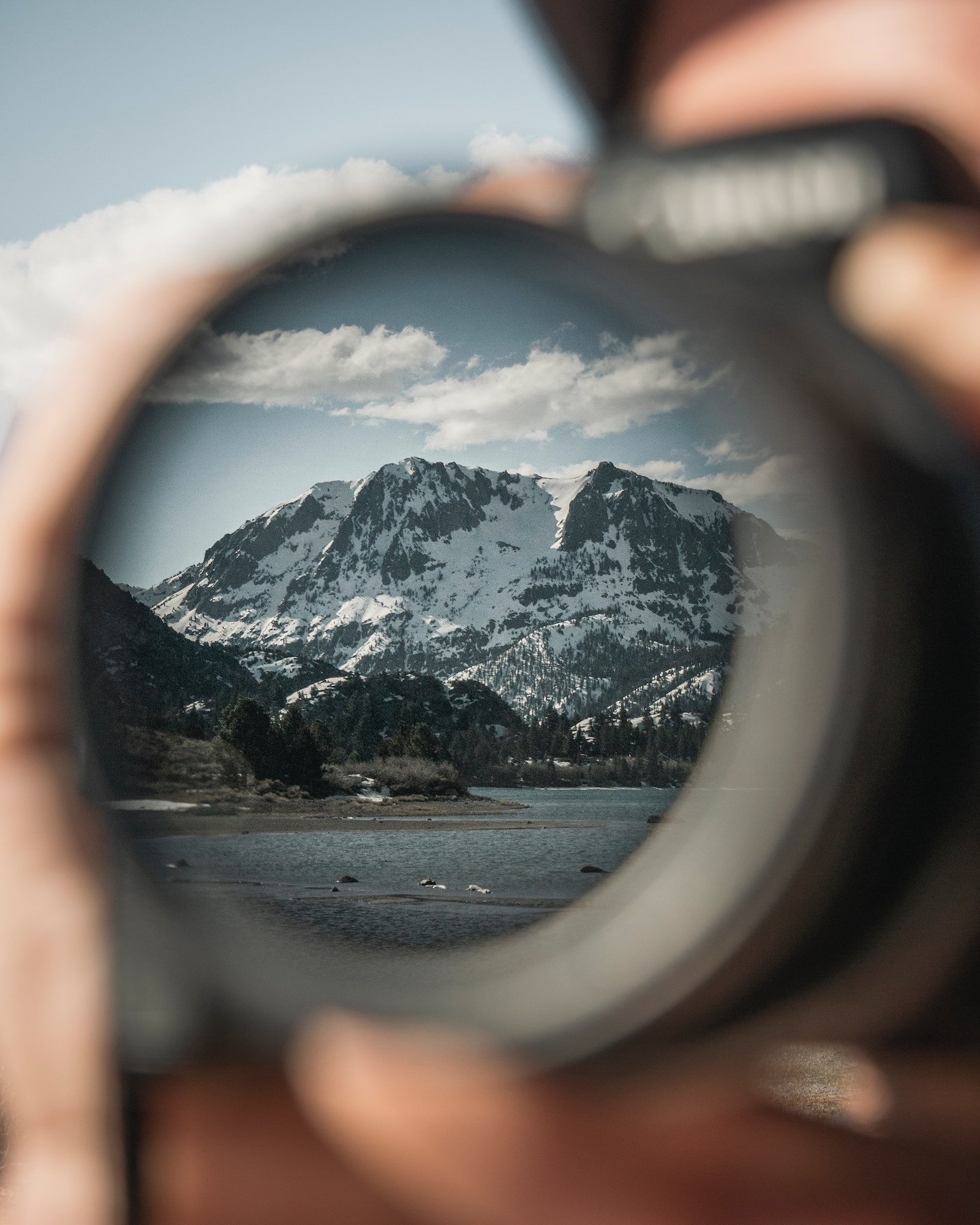
How to edit your photos but still make them look natural (+ 3 mistakes to avoid)
Take a quick look at this photo above and tell me… which photo creates more emotion? And which one do you prefer?
Indulge my curiosity and tell me: why did you prefer that one? And what is your honest opinion on photo editing and presets?
Do you think it's creative, expressive and emotive? An artistic perspective of the world, not just as we see it, but as we feel it?
Or do you think it's unnatural? Fake? Cheating? Obscuring and distorting natural reality?
Because quite a few people people think that and I see their point. I mean, I used to think like that too - so no judgements here.
Honest story: Yes really, I didn't use to be a fan of editing.
Actually, I didn't really understand editing or digital photography, so the idea that you could tweak colours, adjust tones and really do magic outside of just light exposures and ‘Auto Enhance’ - was completely foreign to me.
But nowadays, I no longer feel obliged to simply share what the camera captured - but rather what MY feelings and emotions captured.
And I share this through mixed compositions of colours and tones - just like a painter would.
As my editing style continues to change and evolve, I'm always discovering new techniques and tricks.
Which is why I want to shine some light on how you can edit in a way that still honours the natural beauty of the original scene.
This blog post is a series of tips for all the purist photography lovers out there who would like to bring back emotions into their photos with editing, but without swaying too far from that natural style.
CONTENT:
Play with Tonal & RGB Curves for a natural style
Adjust HSL to achieve natural colour hues
Adjust Temperature and Tint for natural warmth
Top 3 editing mistakes to avoid 'fake looking photos'
How Presets help to achieve a natural soft editing style
1. Play with RGB Tone Curves for a natural style
The RGB (red green blue) Tone Curves are probably a photography editors biggest and best kept secret! They make the biggest difference!
Depending on your camera settings, your photos might turn out slightly flatter or with more contrast than in real life. Perhaps you were going for the 'rustic' look, but it just didn't come out the way you saw it.
Within the tone curve, the default is RGB (ie. all the colors) but you can also select the tone curve for each specific color (Red, Green, Blue). Playing with the RGB curve gives the image so much more depth.
I'd suggest creating 5-6 points and start adjusting the mid to dark side of the tonal curve (left side) and see how it changes the shadows and mid-tones.
I'm not going to go in-depth with how RGB Tone curves work... but here's a great article you can read about that: Lightroom Colour Curves

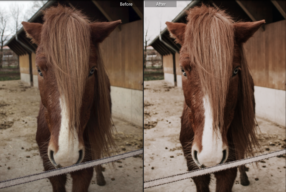
Example of how much ‘moodier’ the photo looks just by playing around with the tone curve and individual RGB curves
2. Adjust HSL to achieve natural colour hues
HSL stands for Hue, Saturation and Luminance. With this tool, we can alter the colours more specifically. Let's take a super practical example:
Sometimes we see photos with either suuuuper pale skin or waaay too oompa loompa orange! This is the perfect example of how HSL can help us correct this back to normal.
Hue is what controls the skin colour and you have a spectrum on either side of the orange. If you drag it too far to the left, you get sunburnt skin. If you drag it too far to the right, you get sunflower coloured skin.
Saturation is what controls the intensity of the colour. Under-saturation makes the skin look pale and ghostly. Over-saturation makes the face resemble an oompa loompa.
Luminance is what controls the light intensity of that particular colour. The lower the luminance, the darker the skin colour. The higher the luminance, the brighter and more washed-out the skin colour.
Tip: Adjust the HSL for Blue to colour correct the sky, and Orange to colour correct skin colour.

Example of Blue Hues being too turquoise, Saturation too high and luminance too bright.

How I would personally have the HSL setting for blue. Subtle hues but not too much.
3. Adjust Temperature and Tint for natural warmth
Temperature dictates how warm or cool the photo will feel. Pull it to the right, your photo will look warmer (think late afternoon sun). Pull it to the left, your photo will look colder (think snow capped mountains).
Tint on the other hand, changes the amount of green and pink. If you pull it to the right, you'll intensify the pink hues (think fiery sunset), and if you pull it to the left, you'll intensify the green hues (think lush green jungle forest).
Why are these important? The thing is, sometimes are camera don't get the White Balance correct. You might have seen a super warm and fiery sunset with your eyes, but go through your photos to find a very blue and rather flat image of the sunset.
Adjusting the Temperature and Tint will make a HUGE difference to that sunset photo and add back the natural warmth, which the camera could not capture.
. . .
DID YOU KNOW?
You can learn so much about these tools and settings simply from studying presets that you like. Learn how to pull various aspects and apply it to your own. Try out my 3 Lightroom mobile presets for free!
Bonus: the Lightroom mobile app is also free to download! So, if you've always wanted to try out presets for your travel photos, then you'll love these! Perfect for beaches and summer destinations →

4. Top 3 editing mistakes to avoid 'fake looking photos’
We've all been there... I've certainly been there. That awkward phase where all your edited photos just look... kinda too much? It's like, woah tone it down just a little, maybe?
Anyway... I wanted to share with the top 3 mistakes to avoid when trying to make a photo look 'natural':
Over-saturation
As I said, oompa loompa coloured skin doesn't exactly look natural, nor does neon light green trees. Go to your HSL tab and pull those saturation bars down!Intense Contrast
Extremely dark shadows with bright highlights does not exactly look natural either. Play with the shadows, blacks, highlights, whites and contrast tabs. And also the RGB tone curves to achieve that perfect natural contrast.Unnatural Hues
The sky is not cyan blue, skin colour is not burning red and the grass is not a dull grey. If you're getting some funky colours, make sure to play around with the Hues tab until you nail that 'natural' colour you remember.
5. How Presets help to achieve a natural soft editing style
If you've always wanted to take a deeper dive into photography, then I can tell you that 80% is in the editing!
I could spend up to 1hr editing and fine tuning a photo. The RGB tone curves always take me SO long to get right! And since editing each and every photo is massively time consuming, this is when presets come in!
Here's a technique not many think to use. If you just spent an hour perfecting your RGB tone curve, then why not save that as a preset? Just the curve on its own.
Applying this to all your photos will help you achieve that consistent styled look, because so much of it is in the Tone Curves.
Tip: I recommend saving it as a preset, because you can also save multiple versions of it. Whereas, if you just copy and paste the tone curve settings, its more time consuming and you're more prone to losing the curve settings.
BONUS! Love me some cheatsheets!
If you've just started out in Lightroom and you're still navigating through it surely but slowly, then you'll love my free Lightroom Editing Cheatsheet!
These shortcuts are gonna help speed up your editing workflow like a ninja!
And that, my friend, is how to edit photos but still keeping it natural. Comment below some questions or beliefs you have about presets and editing! And, as always, I love connecting with you guys on IG → @emilypeilan
Happy editing you creative human!
More blog posts you might find helpful: